What to pack for New York City? This comprehensive guide will equip you with everything you need to conquer the Big Apple, from navigating the diverse seasons to planning for spontaneous adventures. Whether you’re a seasoned traveler or a first-time visitor, we’ll break down the essential items, packing strategies, and considerations to ensure your trip is smooth, comfortable, and memorable.
From spring picnics to winter walks, this guide covers every scenario, leaving no stone unturned.
We’ll explore seasonal adjustments, essential documents, and comfort items to help you pack efficiently and effectively. We’ll delve into specific activities like theatre outings, museum visits, and even shopping sprees, to provide tailored packing lists. This guide also covers safety precautions and cultural considerations, ensuring a safe and respectful experience in the city that never sleeps.
Seasonal Considerations
Packing for a trip to New York City requires careful consideration of the season. The city’s weather can change dramatically throughout the year, impacting your comfort and the activities you can enjoy. Understanding the expected temperatures and potential weather patterns is crucial for packing effectively. This section will detail seasonal clothing choices for different activities and durations of stay.NYC’s diverse weather necessitates adaptable packing strategies.
The city’s temperature fluctuations throughout the year demand a versatile approach to clothing choices. A weekend trip might only require a limited selection of items, while an extended stay calls for a more comprehensive approach, factoring in potential variations in weather patterns. Footwear is also a key element to consider, as it must be suitable for walking, dining, and other activities.
Spring Packing List
Spring in NYC can be unpredictable, with warm days and cool evenings. A versatile approach is essential for comfortable exploration.
- Walking: Comfortable walking shoes are a must, preferably with good arch support. A light jacket or cardigan is also important for evenings. A pair of waterproof or water-resistant walking trousers are recommended for unpredictable weather. Consider a lightweight windbreaker for sudden changes in weather.
- Dining: Dressy casual outfits for dinner in the evening are essential. A nice sweater or light blazer are good options for evenings. Comfortable yet stylish trousers or jeans are suitable for daytime dining.
- Theatre: Dressy outfits, such as slacks, a nice shirt, and a blazer or jacket, are ideal for theatre outings. A light cardigan or shawl is helpful if the theatre is cool.
Summer Packing List vs. Winter Packing List
Summer in NYC brings warm weather, while winter brings frigid temperatures and potentially heavy snowfall. Layering is crucial for both seasons.
- Summer: Pack light, breathable clothing such as t-shirts, shorts, or linen pants, and a light jacket for evening outings. A pair of comfortable sandals, sneakers, or flip-flops for casual wear is sufficient. Consider a lightweight raincoat for sudden showers. A hat or baseball cap will also be useful for sun protection. A wide-brimmed hat, sunglasses, and sunscreen are essential for sun protection.
- Winter: Pack warm layers, including thermal underwear, fleece jackets, a waterproof and windproof coat, and warm hats, gloves, and scarves. Comfortable winter boots are crucial for walking on potentially icy surfaces. A waterproof backpack will help keep valuables dry. Thick socks and warm underwear will ensure maximum comfort. Consider waterproof or water-resistant trousers for possible rain.
Weekend Trip vs. Week-Long Trip
The duration of your trip dictates the amount of clothing you need to pack.
- Weekend Trip: Focus on versatile clothing items that can be mixed and matched. A few pairs of comfortable shoes and a couple of outfits will suffice. Pack a light, foldable bag or backpack for easy transport.
- Week-Long Trip: Pack a wider variety of clothing items, considering potential variations in weather. More comfortable shoes and outfits are needed for different activities and situations. Consider a larger suitcase or duffel bag to accommodate the extra clothing.
Footwear for NYC
Appropriate footwear is crucial for navigating NYC’s diverse terrain.
| Activity/Weather | Footwear Recommendation |
|---|---|
| Walking | Comfortable walking shoes with good arch support |
| Dining | Stylish yet comfortable shoes, such as loafers, or dressy flats. |
| Theatre | Dressy shoes, such as heels or dressy flats. |
| Rainy/Cold Weather | Waterproof or water-resistant boots or shoes |
| Summer | Sandals, sneakers, or flip-flops |
| Winter | Warm winter boots or waterproof insulated shoes |
Essential Items
NYC is a vibrant city, but navigating it efficiently requires careful planning. Having the right essentials readily available ensures a smooth and enjoyable trip. This section Artikels the crucial items to pack for a seamless New York experience.
Essential Documents
Essential documents are vital for a smooth trip. They allow easy identification and access to services. Without them, navigating the city can become challenging.
Packing light is key for NYC, but if you’re headed to a place like St. Croix, you’ll want to check out guide to st croix for a complete packing list. Think layers for unpredictable weather and comfortable shoes for walking all over the city. A good pair of sneakers is a must for navigating the urban jungle!
- Passport:
- Visa (if required):
- Tickets (Flights, Accommodation, Events):
- Driver’s License or State ID:
- Emergency Contact Information:
- Travel Insurance Information:
Crucial for international travel, ensuring entry and exit from the country.
A necessary document for citizens of countries that require a visa to enter the United States.
Proof of travel arrangements and reservations, especially important for seamless check-in and access to your accommodations.
Needed for identification purposes, and may be required for certain activities.
A list of emergency contacts, especially for international travelers, providing a point of contact in case of issues.
Details of travel insurance policies, crucial for unforeseen circumstances and medical emergencies.
Toiletries and Medications
Packing the right toiletries and medications is important for maintaining comfort and well-being. This ensures you have access to personal care items and necessary medications during your trip.
- Personal Hygiene Items:
- Medications:
- First-Aid Kit:
Toothbrush, toothpaste, soap, shampoo, conditioner, deodorant, etc. These are necessary for daily hygiene.
Prescriptions and over-the-counter medications, along with a copy of your prescriptions for any required medical assistance.
Band-aids, antiseptic wipes, pain relievers, and any personal medical necessities.
Universal Adapter
A universal adapter is a must-have for any electronic device. Many international devices have different plug types and voltage requirements.
A universal adapter ensures that your devices can be used with the electrical outlets in NYC.
- Universal Adapters:
A universal adapter allows you to plug in devices without worrying about compatibility issues.
Essential Gadgets and Technology
Essential gadgets and technology can enhance your experience. From navigation to communication, these tools make your trip more convenient.
- Smartphone:
- Portable Charger:
- Camera:
- E-reader (Optional):
- Navigation App (e.g., Google Maps):
A smartphone with a reliable data plan provides access to maps, directions, and communication tools.
Keeps your devices powered up on the go, crucial for maintaining communication and navigation throughout the day.
Capturing memories is essential, and a camera allows you to document your trip.
For those who enjoy reading, an e-reader is a convenient way to access books and articles.
A navigation app can guide you through the city, making it easy to reach your destinations.
Organizing and Packing Electronics
Proper organization and packing of electronics is important to avoid damage and ensure easy access.
- Protective Cases:
- Dedicated Bags/Pouches:
- Packing Cubes (Optional):
Using protective cases for your devices prevents damage during transit and daily use.
Using separate bags or pouches for your electronics helps keep them organized and easily accessible.
For those who want an organized approach to packing, packing cubes are an excellent way to keep your electronics and other belongings separate and organized.
Comfort and Convenience

NYC is a vibrant city, but navigating it comfortably requires careful planning. This section focuses on travel accessories, practical items, packing techniques, and choosing clothing that caters to both style and ease of movement. By prioritizing comfort and convenience, you can fully enjoy the energy and experiences NYC offers.Careful consideration of comfort and convenience is key to a smooth trip.
Packing smart, choosing the right clothing, and preparing for travel needs are essential for a relaxed and enjoyable experience. This includes utilizing packing techniques to ensure easy access to frequently used items and incorporating comfortable travel accessories.
Comfortable Travel Accessories
Travel accessories can significantly enhance your comfort and ease of movement. Consider a lightweight, foldable travel backpack or a comfortable, supportive tote bag for carrying essentials. A neck pillow or eye mask can be beneficial for restful travel, particularly on long journeys. A portable charger is also crucial to keep your electronic devices powered up. A travel-sized first-aid kit with essentials like pain relievers, bandages, and antiseptic wipes can be extremely useful for minor ailments.
Packing light is key for NYC adventures! Don’t forget comfortable shoes for all that walking, and layers for the unpredictable weather. Before you jet off, make sure you’ve got your visa sorted out, too. Researching visa requirements for China, for example, is crucial if that’s your next destination after your NYC trip. visa requirements for china A good pair of walking shoes, a versatile jacket, and a camera to capture the amazing sights will round out your NYC essentials.
Practical Items for a Smooth Trip
Packing light and practical items is essential for a stress-free trip. A reusable water bottle, especially important for hydration, and a small, compact snack bag with healthy and energy-boosting options (like granola bars, nuts, or dried fruit) will prevent unnecessary stops and keep your energy levels up. A lightweight, foldable umbrella or poncho will protect you from unexpected weather changes.
A small, portable journal and pen will allow for quick notes and reflections on your experiences.
Packing Techniques for Easy Access
Strategically organizing your luggage will make it much easier to find what you need when you need it. Rolling your clothes instead of folding them can save space and prevent wrinkles. Packing cubes or compression bags can also help you maximize space and organize your items by category. Placing frequently used items, like toiletries, phone, and wallet, in easily accessible areas of your bag will save you time and frustration.
Packing light for NYC is key, but don’t forget layers! You’ll want comfortable walking shoes, and a versatile jacket. Speaking of venturing out, you should definitely check out the work in progress essential galleries of riyadhs blossoming art scene for a taste of the city’s vibrant art scene. Plus, a good book or two for downtime is always a good idea for any trip.
So, pack smart, and get ready for an unforgettable New York experience!
Utilize the space in your bag effectively to avoid bulky and disorganized packing.
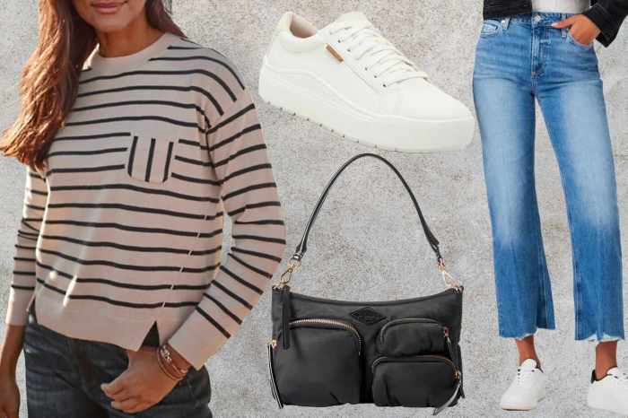
Choosing Comfortable and Versatile Clothing for NYC
NYC’s diverse weather requires versatile clothing choices. Choose garments made of breathable fabrics, such as cotton or linen, that can handle fluctuating temperatures. Layering is crucial, as temperatures can change rapidly. Comfortable walking shoes are essential for navigating the city’s streets. A lightweight jacket or sweater is also helpful, as well as versatile pants that can transition from day to night.
Choose clothes that are easy to wash and dry for a more stress-free experience.
Organizing Packing to Minimize Travel Stress
A well-organized packing system will ease your travel stress. Create a packing list in advance, categorizing items by clothing, toiletries, documents, and accessories. This will help you ensure you haven’t forgotten anything critical. Pack your toiletries in a separate, clear bag to avoid spills and mix-ups. Label your bags and luggage with your name and contact information to minimize potential loss.
Use a checklist to track items as you pack them to ensure you haven’t missed anything.
Activity-Specific Items: What To Pack For New York City
NYC offers a whirlwind of activities, from bustling museums to vibrant nightlife. Packing strategically for these experiences can significantly enhance your trip. Careful consideration of the specific activities you plan to engage in will allow you to pack only what’s necessary, avoiding excess baggage and unnecessary weight.Planning your packing list around your activities will not only make your trip more enjoyable but also more efficient.
By packing items tailored to the events and experiences you’ve planned, you’ll be better prepared and less stressed.
Museum Visits
Museum visits often involve walking, standing, and potentially exploring exhibits in various areas. Comfortable shoes are essential, alongside a reusable water bottle and a small backpack to carry essentials like a camera, a notepad, and a light jacket for fluctuating temperatures. Consider a small, lightweight umbrella in case of unexpected rain.
Sporting Events
For sporting events, a comfortable outfit for cheering is key. Pack layers, as stadium temperatures can fluctuate. A small backpack or fanny pack for essentials like a phone, wallet, and a small snack is also useful. Don’t forget a reusable water bottle to stay hydrated.
Nightlife
Nightlife adventures in NYC demand versatile clothing and accessories. Pack layers to adjust to varying indoor and outdoor temperatures. Consider a lightweight, foldable jacket or cardigan. Comfortable shoes are crucial for navigating busy streets and clubs. A small clutch or purse for your valuables is also a must.
Exploring Different Neighborhoods
Exploring different neighborhoods requires flexibility in your packing. Pack versatile clothing items that can be mixed and matched. Consider comfortable walking shoes, a light jacket or sweater, and a reusable water bottle. A small backpack for essentials like a phone, wallet, and a light jacket or sweater will also be helpful.
Family Trip vs. Solo Trip
Packing for a family trip to NYC involves more considerations. Pack for a variety of ages and needs, including extra clothing, diapers, or other necessities. Consider larger bags or rolling suitcases to accommodate multiple people and their belongings. A solo trip to NYC might require fewer items, but you’ll still want to prioritize essentials like a comfortable purse or backpack, appropriate clothing, and comfortable shoes.
Shopping Excursions
Shopping excursions in NYC require packing for carrying your purchases and potentially navigating crowded areas. A sturdy tote bag or shopping bag is essential, along with comfortable shoes for walking and carrying your items. A lightweight jacket and a reusable water bottle are also helpful.
Concerts and Conferences
Packing for concerts involves considering the venue, weather, and duration of the event. Pack layers for fluctuating temperatures and a small backpack for your essentials. For conferences, professional attire, comfortable shoes, and a laptop bag or portfolio are recommended. A small notebook and pen for taking notes is also helpful.
Packing List Structure

Packing for a trip to New York City requires careful planning. A well-organized packing list can prevent stress and ensure you have everything you need. A structured approach ensures you don’t overpack or forget essential items. This section will delve into various methods for creating and utilizing a comprehensive packing list.
Packing List Table Format
A table-based packing list provides a structured overview of your belongings. This format is especially helpful for visual organization and easy reference. It allows you to clearly see the quantity, description, and any notes for each item.
| Item | Quantity | Description | Notes |
|---|---|---|---|
| T-shirts | 3 | Short-sleeved, breathable cotton | Pack neutral colors for versatility |
| Jeans | 1 | Dark wash, comfortable fit | |
| Sweater | 1 | Warm, lightweight fleece | Suitable for cooler evenings |
| Sneakers | 1 pair | Comfortable, durable | Suitable for walking |
Packing List Bullet Point Format
A bullet-point list is useful for quickly reviewing and checking off items. Categorizing items into clothing, electronics, documents, and accessories helps you maintain a clear and concise packing list.
- Clothing:
- T-shirts (3)
- Jeans (1)
- Sweater (1)
- Underwear (3)
- Socks (5 pairs)
- Electronics:
- Phone
- Charger
- Camera (optional)
- Documents:
- Passport
- Flight tickets
- Hotel confirmation
- Accessories:
- Wallet
- Sunglasses
- Hat
Packing Cube System
Packing cubes are a practical method for organizing clothes and accessories. They keep items compressed, reduce wrinkles, and improve space utilization in your suitcase. A color-coded system can further enhance organization.
- Different-colored cubes for different categories (e.g., shirts, pants, toiletries).
- Compresses clothing and accessories, minimizing space and wrinkles.
- Easier to locate items in your suitcase.
Visual Representation of Packing List (Flowchart)
A flowchart provides a visual guide to packing. It Artikels the steps involved in creating a packing list and organizing your belongings. Start with gathering your essential items and end with a final check-off.
A packing flowchart would visually illustrate the stages: Gathering Items, Categorizing Items, Packing Cues, Final Check.
Packing Checklist for Various Scenarios
A packing checklist is adaptable for different trip types. Consider the duration, activities, and number of people traveling.
- Solo Trip: Focus on essentials and lightweight items. Consider a small backpack for day trips.
- Family Trip: Pack multiple sets of clothing, shoes, and entertainment for children. Include items for meals and snacks.
- Business Trip: Pack professional attire, necessary documents, and charging cables for electronics. Include a formal outfit for potential meetings.
Safety and Security
NYC is a vibrant city, but like any bustling metropolis, it’s important to be aware of potential safety concerns. This section provides practical tips for staying safe and secure while you explore the city, protecting your valuables, and keeping your important documents safe during your trip. Knowing the risks and taking proactive steps can help ensure a smooth and enjoyable experience.
Valuable Protection Measures
Protecting your belongings is crucial, especially in a crowded environment like NYC. Keeping valuables close and out of sight is paramount. Consider using a money belt or a secure inner pocket to carry cash, credit cards, and passports. Avoid displaying expensive jewelry or electronics, as this can attract unwanted attention. If using a backpack, choose one with secure closures and carry it in front of you, rather than on your back, to maintain awareness of your surroundings.
Furthermore, consider using RFID-blocking wallets or cases to prevent electronic theft.
Staying Safe While Exploring
Staying vigilant and aware of your surroundings is vital for personal safety. Walk in well-lit areas whenever possible and avoid walking alone at night in isolated locations. Be cautious of your surroundings, especially in crowded areas like subways and tourist attractions. Avoid displaying large sums of cash or expensive items in public. Trust your instincts; if a situation feels unsafe, remove yourself from it.
Utilize the city’s public transportation systems effectively, staying alert for pickpockets. Be aware of your belongings and keep them within reach.
Important Document Security
Protecting your important documents, such as passports, visas, and tickets, is critical. Consider making photocopies of essential documents and storing them separately from the originals. This way, you’ll have copies readily available if the originals are lost or stolen. Keep your documents in a secure, tamper-proof case or envelope. Consider using a secure document storage pouch or a waterproof bag.
If you’re using a hotel safe, be sure to store your documents in a tamper-proof container to prevent unauthorized access.
NYC-Specific Security Concerns and Mitigation
NYC, like any major city, has specific security concerns. Pickpocketing is a common issue, especially in crowded areas like tourist attractions and public transportation. Be mindful of your surroundings and keep your belongings close. Be aware of scams, especially those targeting tourists. Research common scams prevalent in the city and take necessary precautions to avoid falling victim.
Avoid getting involved in conversations or situations that seem too good to be true. If approached by someone who seems suspicious, trust your instincts and remove yourself from the situation. Be cautious when using public Wi-Fi, as it can be vulnerable to hacking. Utilize secure Wi-Fi connections whenever possible.
Cultural Considerations
New York City is a vibrant melting pot of cultures, and understanding its nuances will make your trip smoother and more enjoyable. From navigating social etiquette to choosing appropriate attire, being mindful of local customs enhances your experience and fosters respect for the city and its residents. This section delves into essential cultural considerations for a fantastic NYC adventure.
NYC Social Etiquette
Understanding basic social norms is crucial for a comfortable and respectful visit. New Yorkers are generally efficient and value direct communication. While not rude, a more formal approach may be required in certain situations, such as business settings or interactions with strangers. Being mindful of personal space is also important; maintaining a comfortable distance during conversations or on public transportation is a common practice.
Avoid overly boisterous or disruptive behavior in public spaces. Respect for personal space and quiet enjoyment are crucial for a harmonious experience.
Appropriate Clothing for Different Settings
NYC’s diverse atmosphere necessitates flexibility in your wardrobe choices. Casual attire is prevalent, especially in neighborhoods like Greenwich Village or the East Village. However, formal settings, like museums or upscale restaurants, may call for more polished attire. A good rule of thumb is to dress in a way that feels comfortable yet appropriate for the occasion.
- Casual Settings: Jeans, t-shirts, sneakers, and casual dresses are perfectly acceptable for most everyday activities. This is suitable for exploring parks, walking around neighborhoods, and enjoying street food.
- Formal Settings: For museums, theaters, and high-end restaurants, consider more formal attire, such as dress pants, a nice blouse or top, and dress shoes.
- Business Meetings: A professional, business-appropriate outfit is necessary. Suit jackets, dress pants or skirts, and appropriate footwear are recommended.
- Nightlife: Dress code can vary significantly depending on the specific venue. While some clubs or bars have a casual dress code, others may have more formal standards.
Clothing Recommendations Based on Trip Type, What to pack for new york city
The type of trip significantly influences clothing choices. A sightseeing trip necessitates comfortable walking shoes, while a shopping trip might require more versatile attire for different stores.
- Sightseeing Trip: Comfortable walking shoes, layers for fluctuating temperatures, and a light raincoat are essential. Consider a reusable water bottle for hydration and convenience.
- Shopping Trip: Versatile clothing suitable for navigating various stores and potentially unpredictable weather. Comfortable shoes are crucial for extensive walking.
- Romantic Getaway: Consider clothing that combines comfort and style. This could involve dresses, stylish tops, or trousers and stylish jackets. Choose shoes that are comfortable for walking and exploring.
- Business Trip: A professional wardrobe is a must, including appropriate business attire for meetings and events. Comfortable walking shoes are essential for navigating the city.
Respectful Behavior in NYC Situations
NYC is known for its diverse population and various cultural backgrounds. Respecting the local customs and demonstrating good manners enhances the overall experience.
- Public Transportation: Respect personal space and avoid loud conversations. Yield to others, and be mindful of your belongings in crowded areas.
- Restaurants: Be mindful of noise levels and wait times. Be courteous to staff and fellow diners. Respect restaurant rules, including dress codes or noise limitations.
- Museums and Galleries: Follow the museum’s guidelines and instructions. Be respectful of the art and exhibits. Refrain from disruptive behaviors, such as loud conversations or inappropriate touching.
Local Customs and Packing Adaptions
NYC’s unique atmosphere requires adaptability in your packing. Be mindful of the city’s diverse population and respectful of its local customs.
- Public Transportation: NYC’s subway system is a vital part of the city’s infrastructure. Pack light, comfortable, and versatile clothing for travel on public transportation.
- Food Culture: NYC boasts diverse cuisines. Be open to trying new foods and respecting local customs in restaurants and food markets.
- Neighborhood Cultures: NYC’s diverse neighborhoods each have unique customs and traditions. Be mindful of these cultural differences and show respect for local traditions.
Summary
Packing for New York City is all about preparedness and adaptability. By considering the season, your activities, and your personal needs, you can create a packing list that suits your trip perfectly. Remember to prioritize comfort, practicality, and safety. From the essentials to the fun extras, this guide is your ultimate companion for a stress-free and enjoyable New York City adventure.
Happy travels!